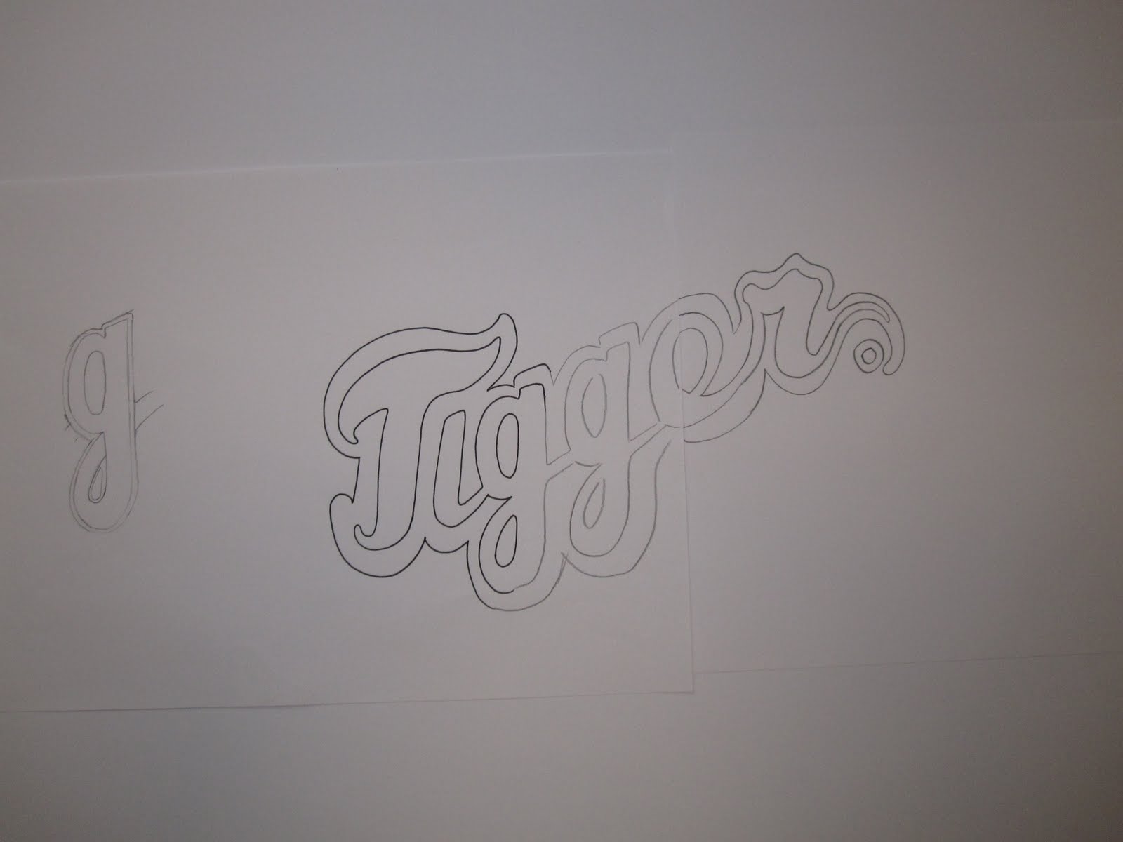
Went back to working on the logo for 1 of the 4 DJ's, Tigger. I thought I had a pretty good idea for the logo, so drew a finalised version of this (2) but from recent research and some typography designs that I found I tried out a new idea (3). Taking inspiration from some Baseball related designs.
 2.
2.
3.

Out of the two ideas I felt the new design was much better suited to Tigger as it is more fun and lighthearted, matching the person and the energy of the music he plays. Im not throwing the previous design away as I may use it for one the of the other DJ's.
From here I developed the drawing, changing little bits and playing with the backdrop / border.
4.

5.

6.

Having a border / stroke design above, or bold backdrop below.
Took some consideration and asked people around the studio on what they felt would work better. Got told that there is a slight danger with using a thin border as when made small (say on a business card) the logo will lose a lot of boldness. Aswell as this I just preferred the backdrop design as it makes it a lot bolder, standing out from anything else.
Developed this further, tweaking small bits and bobs.
7.

8.

9.

10.
11.

Finally coming to the above image, still needs some slight tweaking in parts I feel, but it is in a strong enough state for me to go away and digitalise this and then get feedback from Josh (record label owner) and Tigger himself.
No comments:
Post a Comment