Showing posts with label OUGD202. Show all posts

Sunday, 14 February 2010

SELF EVALUATION

What skills have you developed through this module and how effectively do you think you have applied them?


This is the first time i’ve had any experience with After Effects, i feel i learnt and showed a fair understanding and knowledge of the software. I feel that i applied them effectively, certainly within the silent movie brief to portray my chosen word and had sufficient skills within the program to create some interesting idents. 

I feel that during this module my organisational skills have developed and by doing so made me feel quite calm about the work load, happy that i was going to get everything done that i wanted and needed. From essentially just creating lists of things i needed to do and when roughly i wanted them done by and the organisation of these lists made me efficient with the time i spent working. 

I’ve also learnt another new software this module, DVD Studio Pro. At first i thought it was quite easy and it would be a doddle, however when i came round to making it, all understanding of the program had vanished, despite this i made an efficient dvd, keeping it simple and easy to use. 

I feel i have also developed my skills in package design, with being a bit more organised and efficient with my time gave me more time considering my packaging. Returning to a book i looked at for my previous packaging (OUGD201) where i designed the detail for a piece of packaging. This time round i concentrated on the actual structure and net design of the packaging and considered the aesthetic design second, i feel all this shows by my packaging as it is a strong point of my project. 


What approaches to/methods of research have you developed and how have they informed your design development process? 


I feel i have developed my research process to become totally relevant and fully fuel all of my design decisions, which i don’t think i have always done during previous briefs and modules. Looking at existing imagery directly concerning the subject and taking aspects of the designs, say typefaces or colour and taking them into my own designs, instead of just choosing ones that i feel work regardless of anything else. I feel i spent a lot more time into research specially with the latter brief, (Movie Season) looking at all aspects of the subject to get a full understanding of it and i feel this shows through my design process. 


What strengths can you identify in your work and how have/ will you capitialise on these? 


I feel that one of my strengths was my research lead design, showing thought and logic being the reasons for my design decisions. Capitalising on this to have my designs being strongly suited and representative of the subject. 

I feel the quantity of my work for this brief is one of the strengths and also regular posting to my blog aiding my design process as it helps show me where i actually am with the work and the on going process of self evaluation helping to find the path to take next and solve the problems i was having. 

I also feel my hand-made design packaging is a strength within the latter brief, this being from a good amount of time spent on designing it, due to organisation of my time. So i can capitialise on this by always trying to be as organised as i can.   


What weaknesses can you identify in your work and how will you address these more fully?


One weakness i feel i have with my work is that a lot of my design work doesn’t look as slick or professional as some of the other work around the studio. Planning to work on this in later briefs and have that as a definite aspect of my design, doing so by really looking into existing professional design and all aspects of that. 

One weakness i also feel is evident through my work is the lack of imagery. I feel as though some of the videos i made, now looking back at them could have been improved with the use of some imagery. So i plan to address this by during my future briefs to always create an idea using imagery, this helping to have a fuller and broader design process. 

I also feel another weakness within my design is my skills within After Effects, i liked my idents and the videos i created however i do feel they are not the result of high level of skill within the software, using only basic movements and animation. So to address this i will if choose to use the software again is look into more interesting and difficult things i can create and animate. 


Identify 5 things that you will do differently next time and what do you expect to gain from doing these?


. Use imagery within my idents, gaining a more intricate and developed designs, 

something even more representative of the subject. 

. Look at using more difficult processes within After Effects, gaining a fuller understanding of the software, animation as a whole and also gain from it much more professional and slick videos.

. I will also concentrate more on primary research during my design process, gaining a more personal and fuller body of knowledge concerning my chosen subject. 

. Organise my blog more frequently, clearly labeling all posts, making it easier to read and follow. 

. Start a more regular process of gaining feedback from fellow classmates and staff around the studio. Getting more constant critical assessment from others aiding my design development to get the best final product i can.   


Attendance   4 

Punctuality     3

Motivation      4

Commitment     4

Quantity of work produced    5

Quality of work produced     3

Contribution to the group    4

Friday, 12 February 2010

Thursday, 11 February 2010

Movie Season / RATIONALE

Brief Title 


Will Ferrell comedy movie season.


I decided on the Movie Season brief and chose one of the first ideas that came to mind, Will Ferrell comedies. My concept is to produce the 5 idents promoting Ferrell’s films by focusing on his iconic comedy style. Visualizing this by taking quotes from his films and using motion graphics to animate them into idents. 


The tone of voice will be one of tongue-in-cheek humor, with the idents being bold, clear and in your face matching the quotes and the type of comedy sampled. 

My target audience will be varied from both males and females from the ages of 16 - 40, as the majority of Ferrell’s films i feel have a wide audience themselves catering for mature adults to adolescent teens.  


In terms of design my idents will be type based as to portray and emphasize the quotes sampled. My design decisions have been made logically from analyzing existing artwork from a range of Ferrell’s movies considering Typefaces and colours used. 

The idents will all be quite fast paced with kinetic type animated in sequence and time with the original quote from the movie.

As i said i will be sampling audio from the films to obtain the quotes, aswell as this i shall have a song in the background that builds up and fades out after the quote ends, this stopping the idents ending abruptly.  


Wednesday, 10 February 2010

DVD Packaging

Designs for the black box part of the packaging... 
i was originally going to use yellow but i thought due to the shine of the sticker it might work well and look more pleasing if it were printed in black, i shall soon find out!

DVD Packaging

So taken it a bit further, yellow sleeve over the box, this representing some of the imagery used in my videos. 


I like it but i need to add information and detail onto the black box, I have decided to use vinyl stickers to do so. This enabling me to print vivd colour and still have it show on the black card, It shall also add a gloss-like finish to the box. 


DVD Packaging / Design

Sleeve Design


Using both Arial Black and Impact the typefaces i used in my two briefs and also using Helvetica for my name, this taken from my creative CV i created a few weeks back. This will be printed onto yellow stock. lovely. 


DVD Packaging

Mock Up


Different stock, black card. Looks the best out of what i've used so far, it is a bit plain though. Printing onto black might be hard, specially to make whatever goes on it bold and in yo face. Which is the style i want to maintain from my videos. 
Also chosen to make the inside sleeve the be made of yellow stock, fitting in with the colour scheme from the videos. 

DVD Packaging

Rationale 

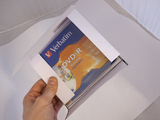
So for my packaging, after creating mock ups of the folding, tab box and the vinyl style cover i have chosen to re-design the box to a smaller depth and fit the vinyl sleeve inside the box instead of a CD case, In terms of design on the packaging, i will be taking the design styles from my two groups of videos, Using either one or a mixture of Helvetica, Arial Black and Impact and focusing on the colour scheme of yellow white and black. 
All i need to go on the package is my name and the brief title/code-OUGD202. I would also like to have something to say 'Look at my blog for more research and development somewhere on there! 

DVD Packaging

Another Mock up for the fancy box, this time drawing a strange illustration on the paper before hand, not relevant to my project, but it looks really nice and i knew it would so i just did it!

DVD Packaging

Mock Ups


This is my mock up of the packaging i liked from one of the books i looked at, i really like it, simple yet really effective piece of packaging, interactive as have to pull the tab out and unfold. Im pretty sure this will be either the packaging itself or part of it. 

DVD Packaging

Net plan / Vinyl sleeve 
Made this on illustrator, 13 x 13 to hold a CD snuggly, if i choose to use this as part of my packaging then this net allows me to play around with designing onto it, using the correct dimensions. 

DVD Packaging

This is the first mock up idea  i had. Loosely based on the packaging for a vinyl record, something minimal that is efficient, 


Possibilities include a sticker / label which holds the disk in place, then torn to open, this could be quite interesting as an asset of the design withholding the idea of interactivity (DVD). Other than this it would be a digital print on the stock, Module title, my name. Nothing more needed, apart from maybe a word about my blog.
I like this form of packaging however i feel i can add to it make it a bit more interesting and aesthetically pleasing. 

Tuesday, 9 February 2010

DVD Interface / Studio pro

Showing my process within Studio Pro, this is the basic schematic for it, i need to design a few more slides and add them to it, mostly saying to look at my blog for research and more in-depth development including storyboards and test animations


Monday, 8 February 2010

DVD Interface / Design Development

New Schematic

With the re-assessment came a new schematic for me to work from, its more simple than the first and i feel will work better and more fluidly as a DVD.

DVD Interface / Design Development

From first tackling DVD Studio Pro today it became apparent that i actually didnt know it aswell as i thought i did! I managed after a while and some help to know what i was doing and what had to be done to get the results i want, firstly i needed to redesign the assets(backgrounds) in Photoshop to create layers, doing this enabling me to have flashing buttons, which is needed. Secondly the way i wanted to portray all of my work wasn't going to be that easy so i had to go away and re-assess things.


So what i have done is shorten the Brief menus down to, Storyboards & Movies. The problem with trying to get across my research is that its a mixture of videos and images and analysis and to try to put this in the dvd would not only make it confusing for me but i feel also for the viewer who would have to cycle through loads of stuff to get anywhere! Furthermore i feel the storyboards will show a good process of development.

Movie Season / Post production


These will also be put onto my DVD!

Saturday, 6 February 2010

Movie Season / FINAL IDENTS


DVD Interface

Contact


This is my contact page, as i said i want the dvd to serve not only as part of this brief but something i could maybe send alongside a creative CV, so i thought to have a contact page in it, this is the first design and i think i will change it a little, basically to make it fit in more with the rest of the dvd, but it will look a lot like this. 

DVD Interface

Movie Season  

Pretty much the same though process as the screens for the Silent Movies, same type and colour as the videos for this brief. (Blue changed to cyan to compliment yellow and be more attracting) 


I think they work really nicely all together, only thing is, that has just come to mind on i think will be the intial movie screen i want to have button that takes the viewer to my contact page, so i need to do that!


DVD Interface

Silent Movie

From choosing the 'Silent Movies' button, the viewer will be taken to the following screen. From here you are able to navigate through the project. Using the colour scheme and typeface - Arial Black, from my videos.


Again using the + and - for the buttons to represent movement of going forward or backwards. As i’ve previously said i want to keep it nice, simple and easy to use, so with this in mind i have designed it so when you choose an option, say ‘research’ at the top left hand side will be the button you just clicked on, then there will be a button to move forwards, which from research is design development (and from that screen the button will be the video screen) then aswell as this there is a back button to go back to the previous screen!