Starting off with referring back to the mock up of the brochure, the exact size of which I have yet to fully specify, I want it to be of a decent size but easily handle-able, something that could fit inside a newspaper / magazine say.


Front page Development
Wanted to have the front cover a bright (possible spot) colour, grab the eye easily, make people want to see what it is, essentially getting them to pick it up and read it. I've purposely kept it all typography based as that is what I like to work too, furthermore cancels out the hassle of getting high quality images. So the front cover will be bright, bold text essentially, keeping the same style / typeface as the rest of the publication...
All I felt I needed to include was the name of the festival, dates and the place / situation and then possibly something on the back...


Thus experimentation came to this as a final draft...
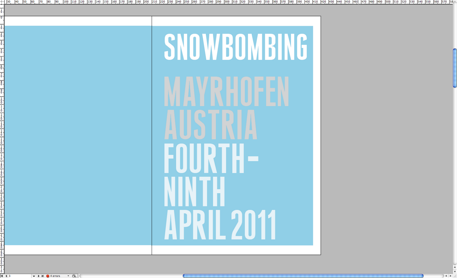
 Front Iv gone for clear white with a very fair grey to create difference within hierarchy so it reads, Snowbombing, Fourth-Ninth, April 2011. Then the place, Maryhofen Austria. Which is what I think it should read, as the festival is growing bigger people who have heard of it will probably know its been in Mayrhofen for the past 5 years. The What, When, Where. Personal choice on what is right!
Then on the back I've gone for one of the best reviews I found of the festival. This being the style for any quotes used throughout the booklet.
MLB Astros is the typeface, good lookin' indeed.
No comments:
Post a Comment