Development / print
From getting home after spending the day designing the logo(s) below I heard back from Rawree and he really liked the finalised logo I sent, describing it as simply, "Bass in your face".
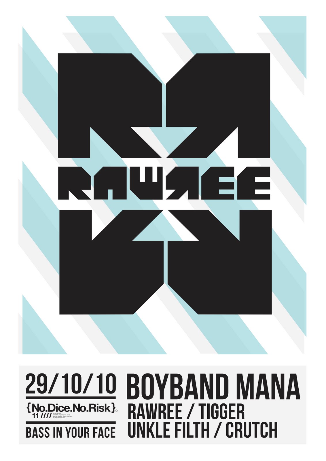
Then came up with an interesting idea, in a few days we were having a nice big house party, where Tigger and Rawree were DJ'n, so I thought why not make some promo style posters and thats what I did that evening.
 To start I played around with colour a little bit, came out with the logo on a striped red background and thought, hey, this has got potential. Played around and found that The logo looked much better in this context with the 4 R's surrounding the 'RAWREE', becoming much more dominant on a page.
  Then I had to include some type, decided I would keep it quite minimal, all I needed to include was, the date and place of the party, who was playing and a logo for NDNR, the label repping the artists.
 Using Bebas Neue, its beautiful but also chose it because its a very condensed typeface, so I'm able to make as much use of the small space as possible without over crowding it.
Played around for some time with the layout, keeping in mind hierarchy, and keeping the design even and easy to read.


 And printed...

Decided to use the thick newsprint again for a few reasons, from using it on a print I did for my first brief I've come to really like it, it has a good rough texture, nice to the touch, its fairly sturdy and most of all its not white, gives it more impact being an off white, sits better on walls that way I feel. Also like this stock as it is cheap! And I'm broke.
Think the posters work well and the DJ's love em and have asked for personal copies, everyones a winner.
No comments:
Post a Comment