 When i was creating the file in the previous post i went to the toilet came back and realised that the layout of the M T A i have been playing with blatently read M A T, and not M T A, school boy error. So I played around a bit and came to this final image of what i think reads MTA quite clearly. I took it to a few people around the studio and they all said it read, (rhyme) MTA. Cheers. The colour scheme is rather nice i feel, i took it from a promo poster for Cotti, one of the labels artists. See Context.
Tuesday, 11 May 2010
Logo Development
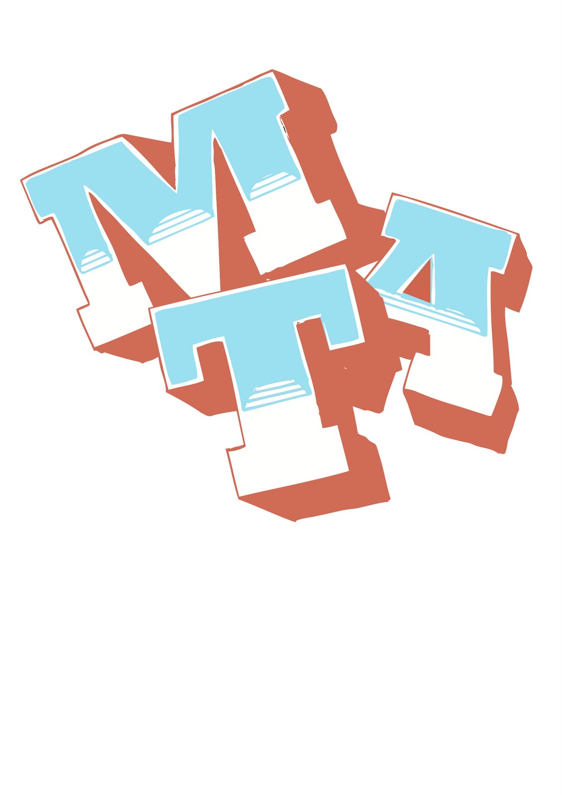
When i was creating the file in the previous post i went to the toilet came back and realised that the layout of the M T A i have been playing with blatently read M A T, and not M T A, school boy error. So I played around a bit and came to this final image of what i think reads MTA quite clearly. I took it to a few people around the studio and they all said it read, (rhyme) MTA. Cheers. The colour scheme is rather nice i feel, i took it from a promo poster for Cotti, one of the labels artists. See Context.
Type Development
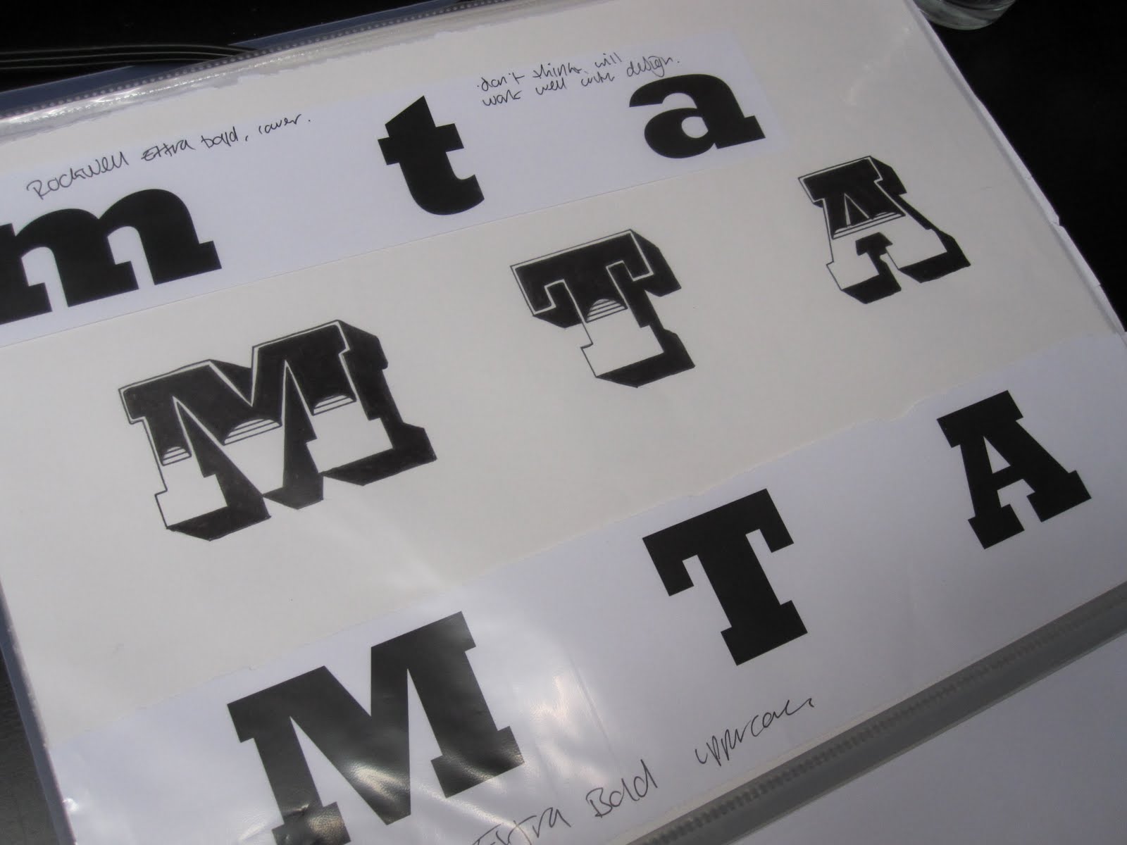
These are the experiments of the vectorized images. To clarify my thinking, I've chosen these typefaces as from my 5 type experiments one that stood out to me was Rockwell. So I've taken that, played with both upper and lower case, then I've chosen a type i had used in my first type exp, similar to Rockwell, slab seriff, Aachin STD. Out of these my favourite is actually the uppercase Rockwell designs, (Bottom issuu file). I have previously said that i want to use lowercase as to make the logo look bit more friendly and approachable however i feel the style and design of the type, put together in that kind of composition works well, looks young, friendly & fresh!
Monday, 10 May 2010
Projerct Folder 3


From deciding to stick with this 3d option I took the final 3 typefaces I have chosen and added the first half of the interior design to them, ( the second half of it i plan to be 3 circles down each stem) From here I intend to vectorize the images in illustrator and experiment with the compositions of the letters, this leading on from my earlier experiments with comp.
Project Folder 2.


Thought i would have a go at just drawing some designs the other night, see what different styles i can create. Most were pretty naff more street art inspired which is something i have been planning to try and steer away from due to the typical image of drum and bass. I do however like the liquid / goo like design, a style of drawn type i've used before for non-course related designs. Something to perhaps fall back on.


Experimenting into the range of 3d and border possibilities with the letters separately, some are quite nice but i think the original look of the 3d letter going to the back right still looks best.
Sunday, 9 May 2010


Type Exp .
From advice i received during the 1-on-1 crit i decided to choose 5 basic type designs that i thought had potential and played around with them, considering composition, colour, weight & range of formats. Finding out how the designs fit across a breadth of media.
I tried to vary the designs, trying different things, comps and colour etc! Some work better than others. Out of them all I like the style and outcome of the Zebrawood & Rockwell typefaces. I've drawn my own version of Zebrawood and that should be posted shortly, I want to draw my own to see what it looks like in lowercase characters, i think it might make it more appealing and approachable! It was easier to be more playful and fun with Zebrawood & Rockwell and this is something else i want to emphasise with the logo design.
Subscribe to:
Posts (Atom)