 When i was creating the file in the previous post i went to the toilet came back and realised that the layout of the M T A i have been playing with blatently read M A T, and not M T A, school boy error. So I played around a bit and came to this final image of what i think reads MTA quite clearly. I took it to a few people around the studio and they all said it read, (rhyme) MTA. Cheers. The colour scheme is rather nice i feel, i took it from a promo poster for Cotti, one of the labels artists. See Context.
Tuesday, 11 May 2010
Logo Development
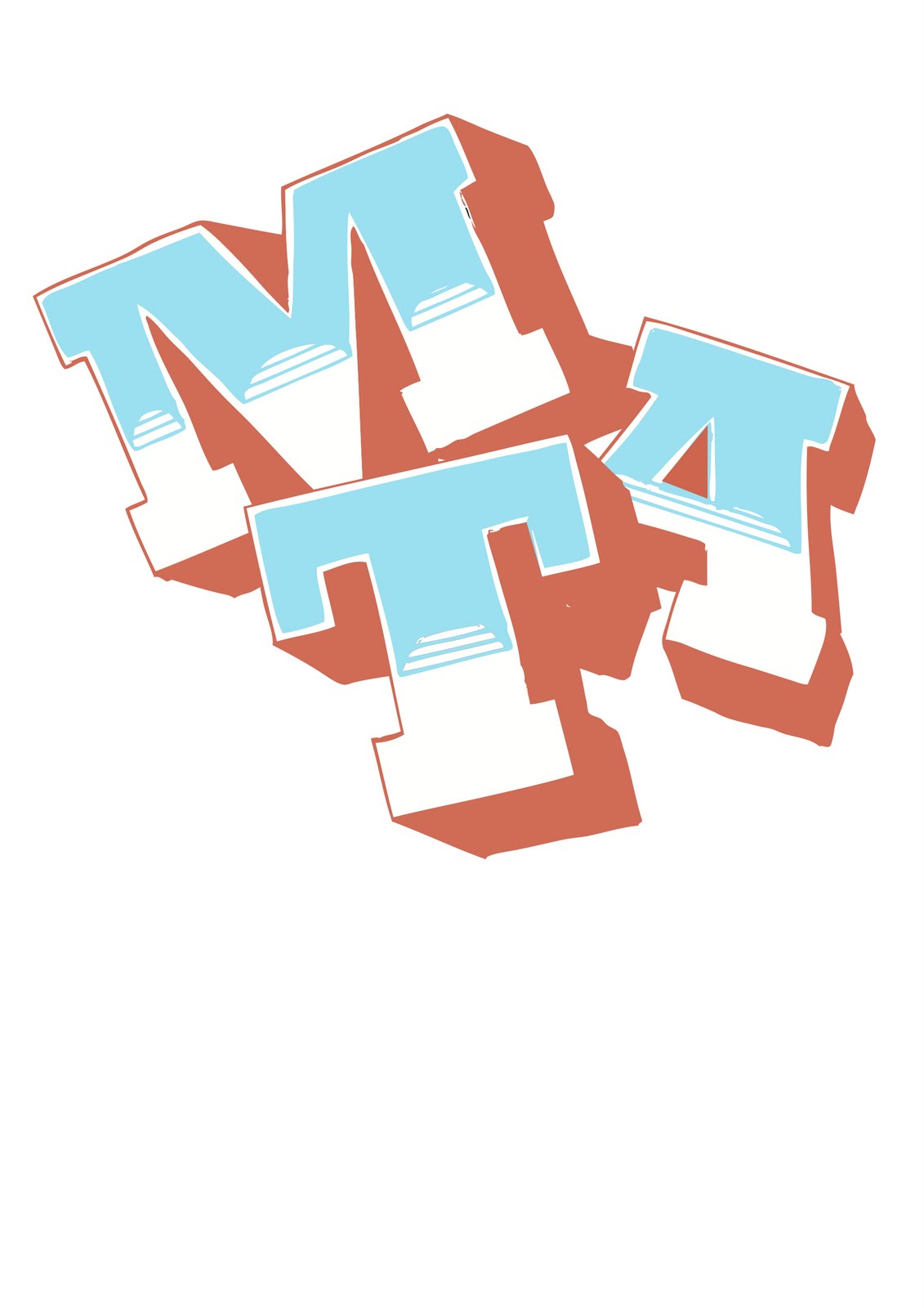
When i was creating the file in the previous post i went to the toilet came back and realised that the layout of the M T A i have been playing with blatently read M A T, and not M T A, school boy error. So I played around a bit and came to this final image of what i think reads MTA quite clearly. I took it to a few people around the studio and they all said it read, (rhyme) MTA. Cheers. The colour scheme is rather nice i feel, i took it from a promo poster for Cotti, one of the labels artists. See Context.
Subscribe to:
Post Comments (Atom)
No comments:
Post a Comment