Tuesday, 30 November 2010
Wille Yli-Luoma
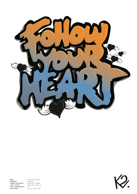
Again forgot to document the whole process for this illustration! Always getting caught in the heat of design, Im just so ruddy passionate about it all.
Anyway standard process. The colour choices came from first using red, with the subject of the quote i felt it was a bit too cliche to have it as red, tried a few other colour schemes, finally coming to this, orange and blue, leading to a darkish grey forming the lighting on the design ( light source being from right hand corner )
From here I wanted / needed to add something extra as I have with all the other illustrations! Tried a few different things, ending up with a graf inspired flying heart, relating to the quote without being to feminine or gay!
Jordan Mendenhall
Next one! Go Vegan, Might have forgotten to document the development with this one, but essentially following the same process as the previous designs, tracing the drawing, choosing the colour, adding highlights and low-lights.
The colour lent itself, vegan is obviously leaning towards green, and the teal blue, nice soft 'friendly' colours. Including the seperate design to make it a bit more related to men / Jordan the rider.
Then working on the logo, took a while but came out with a fairly simple design but effective in its own right, maybe make it a little thicker perhaps? But s'all good.
Apple & celery by the way.
Shaun Mckay
The next illustration for Shaun McKay took me a fair while. The first obstacle was the colour. Looking through images and photos of McKay I first wanted to have a pattern fill, red and white criss cross style of thing, However due to the way in which I was creating the highlights and shadow It wouldn't have worked very well. So with this in mind I experimented and played with these colours seeing if it worked in anyway...
Again playing with using two layers, I wasn't feeling the colours up until this point, so bearing in mind what the illustrations are for and the others which are quite intensely coloured I started to play with using a more coral red and an orange.
Then from finding a good mixture of colour, and adding another layer to create the illusion of light coming down onto the drawing, by having shade on the bottom of the design, adding the high and low lights.
Getting it to a finished state...
Then spending time working on a logo to go with the illustration...
The k's are quite easy to do as they can look strong and easily identifiable whether the strokes are rounded or very straight, wheras the 2 is the hard bit, but finally got it to a point that I was very happy with.
Again playing with using two layers, I wasn't feeling the colours up until this point, so bearing in mind what the illustrations are for and the others which are quite intensely coloured I started to play with using a more coral red and an orange.
Then from finding a good mixture of colour, and adding another layer to create the illusion of light coming down onto the drawing, by having shade on the bottom of the design, adding the high and low lights.
Getting it to a finished state...
Then spending time working on a logo to go with the illustration...
The k's are quite easy to do as they can look strong and easily identifiable whether the strokes are rounded or very straight, wheras the 2 is the hard bit, but finally got it to a point that I was very happy with.
Eero Niemela
Digitalising one of the four remaining snowboard artwork illustrations.
Firstly tracing the drawing, then colour. I made my choice on colour from a photo of Niemela on the team web-page. The image is actually two layers, first layer with just the blue and the second with a 80% opacity and gradient of yellow / gold going to nothing, layed on top.
From there I added the high and low lights, making the words appear more round, 3D and generally just much better!
Then adding the shadows, essentially following the process I had for the first illustration, Chocolate & wine.
From here I had to come up with a K2 logo for Eero and the design which after a quick bit of idea bashing got me to the final image you see here.
Very pleased with it, love the colours, golden / yellow wings taking flight into the sky, sick!
Monday, 29 November 2010
Sizes and Poster Design
So coming to a final decision on size for my booklet / brochure whatever you want to call it!
Considering the context in more depth in my last post I went on to measure the Metro, find the dimensions of that, then reduce a few cm and bang, I've got my format, bearing in mind it will also have to fit inside various magazines.
From this then figure out the possible sizes for the poster insert, The poster being a keep sake, something to put on your wall / notice board / office etc. The content of which is simply the line up for the festival, So the bigger the better really.
INSERT DIMENSIONS OF POSTER AND BOOKLET.
With the dimensions in place, went on to mess around designing the poster...
Came to a point in the design process, where I had to decide whether to keep the exact same style and colour scheme as the booklet or have something a bit different. Think I did it by accident but turning one box black really made it stand out, specially with the blues / white and greys for the text. It made me think that as it was a poster with the line-up on it should stand out and grab the eye, this being something that the black did more than the blue. So decided to mix it up a bit...
Until I got to this, Off A format, should get 2 of these prints to 1 A1 print.
The poster is folded in half, having this as the front, the blue being the top and white bottom.
Then when folded out on the other side, the line up!
Fairly quick but successful design I feel, had nothing but good feedback on it, hopefully will be just as good when printed. Not sure on stock at the moment, for the booklet I intend to use sugar paper, after the successful prints I've had so far using off white, news print I thought I'd continue with it. For the poster though im not too sure, half tempted to try satin, not gloss, think that might be bit too much, but want white paper to make the white stand out and bright! If I had any money, I would print tests on al sorts of paper but it's become far too expensive considering the amount of work I am producing at the moment.
Considering the context in more depth in my last post I went on to measure the Metro, find the dimensions of that, then reduce a few cm and bang, I've got my format, bearing in mind it will also have to fit inside various magazines.
From this then figure out the possible sizes for the poster insert, The poster being a keep sake, something to put on your wall / notice board / office etc. The content of which is simply the line up for the festival, So the bigger the better really.
INSERT DIMENSIONS OF POSTER AND BOOKLET.
With the dimensions in place, went on to mess around designing the poster...
Came to a point in the design process, where I had to decide whether to keep the exact same style and colour scheme as the booklet or have something a bit different. Think I did it by accident but turning one box black really made it stand out, specially with the blues / white and greys for the text. It made me think that as it was a poster with the line-up on it should stand out and grab the eye, this being something that the black did more than the blue. So decided to mix it up a bit...
Until I got to this, Off A format, should get 2 of these prints to 1 A1 print.
The poster is folded in half, having this as the front, the blue being the top and white bottom.
Then when folded out on the other side, the line up!
Fairly quick but successful design I feel, had nothing but good feedback on it, hopefully will be just as good when printed. Not sure on stock at the moment, for the booklet I intend to use sugar paper, after the successful prints I've had so far using off white, news print I thought I'd continue with it. For the poster though im not too sure, half tempted to try satin, not gloss, think that might be bit too much, but want white paper to make the white stand out and bright! If I had any money, I would print tests on al sorts of paper but it's become far too expensive considering the amount of work I am producing at the moment.
Revised Brief
Brief Title:
I’ve got this mate called Josh
The Brief:
Design & produce a visual identity for a new up & coming music label.
Concept / Proposition:
N.D.N.R Records
Bass driven music, 4 artists one love.
Considerations:
What is a visual identity? How far and how big can you make this, what are the possibilities?
Some of the artists also need some form of a visual identity, a logo is a necessity, anything more is up to you.
Target Audience:
Young, mixed sex, roughly 16 - 30 year olds with an interest in electronic, dance bass driven music.
Who listens to the kind of music, where is it played and who goes there?
Tone of Voice:
Youthful, professional, Underground
Background:
N.D.N.R Records stands for No Dice No Risk. This side of the label specialises in electronic dance music, mainly drum’n’bass, jungle, dubstep and occasionally dub & reggae. The artists signed onto the label are all young male DJ’s based around Leeds, London, birmingham & liverpool. They are, Unkle Filth, Crutch, Tigga & DJ Rory. The label will be constant releasing tracks, remixes & monthly mixes.
Mandatory Requirements:
Visual Identity for NDNR Records.
Deliverables:
An appropriate presentation of your designs.
Boards presenting your design process & development.
. Final logo design for NDNR / 4 DJ's
. Business cards for Josh as owner of NDNR
. Business cards for each DJ, forming a set of NDNR artist business cards.
. Stationary & merchandise set for NDNR:
letterheads, compliments slip, envelope, DJ Cartridges, slipmats, vinyl sleeves, Tee's,
. Merch for DJ's:
Tee's, slipmats and New Era hats.
Studio Deadline:
7th December
Posters
5 Logos
Finally got to a finalised stage for all 5 logos.
Each one might need a small tweak here and there, but this will come at a later stage, when I begin to really use these logos and start designing and printing the onto an array of products.
Firstly, the label,
No Dice No Risk.
The reasoning for the look of this was a mixture of some initial ideas I had, feedback from the client (label owner) and a lot of experimentation. Took me quite a long time to get it down to this, a bit too long I think. However saying that Im really happy with what it's become, simple and clean but not boring, visually engaging, something more than just initials or the words. Which I feel a logo for something like this should be. It can also be simplified to just the words in the brackets, for example when printed small say on a business card the smaller text isn't legible, wheras on a larger scale, letterheads / website it shall be fine and readable.
Helvetica, standard. So many companies & brands, big successful ones at that use Helvetica, it makes sense for me to use it really! Hand in hand with my dissertation.
DJ Tigger.
Fun, playful, smiles all round, suits the personality of the DJ to a tea, and hes ginger - colour choice. Successful representation of what I wanted. Will need slight tweakings to make even, concerning the black border. Hand Drawn typeface, taken from American baseball style fonts.
DJ Rawree
Big, dark and dirty. Much more specific to the music this DJ plays, hard bass driven music. Raw. Solid. Another hand drawn typeface, another chance for an alphabet.
DJ Unkle Filth
Fun, varied bit electro funky vibes in terms of music. This logo also took a lot longer than expected A lot of time gone in, and I believe with a few cheeky tweaks, it will be perfect, finally got it to a standard as I pictured it in my head. Hand drawn custom type, with more time I would make an alphabet from it.
DJ Crutch (Me)
Im a world class DJ dont you know. This was the quickest of the logos, as I was designing for me I knew what I wanted, taking inspiration from graphic artist Silo. See context. Bold, prominent, bit of fun! Friendly. Again another hand drawn typeface, alphabets galore.
Although they took a lot longer than I originally thought I believe the wait was well worth it. What I have are 5 logos, all of a strong quality, I feel. All being approved by peers and more importantly the client and DJ's themselves. Furthermore 4 of which using original drawn typefaces, which given the time I would extend into 4 seperate typefaces.
Revised Brief
Brief Three
It’s like Ibizia in the snow
The Brief:
Design some form of a holiday brochure for next years Snowbombing festival.
Concept / Proposition:
Inform the audience & promote the festival so that not only will they know everything about Snowbombing but they feel they have to go.
Considerations:
What information is there to include? Are there details of more importance than others? If so hierarchy will become an issue you must address.
What can a holiday brochure be, what forms can it take? Think a little outside the box, afterall this is Snowbombing not a family holiday to cornwall.
Target Audience:
18-40 boarders, skiers, music enthusiasts, outgoing / sociable / exciting males & females.
Uni winter sport teams.
Tone of Voice:
Mythical, Musical, Exciting
Background:
Snowbombing is a popular and ever-growing winter sport & music festival. It has been running since 2000 across a number of resorts, however from 2005 it has always been hosted by the Austrian resort of Mayrhofen.
The festival has seen many a great artists play, from Madness to FatBoy Slim, Grandmaster Flash to Dizzee rascal, plus pretty much all the big names within electronic and dance music.
Mandatory Requirements:
Holiday brochure for Snowbombing 2011
Deliverables:
An appropriate presentation of your designs.
Boards presenting your design process & development.
.Informational Brochure / Booklet
.Poster insert
.Flyer insert
Studio Deadline:
7th December
Final Draft DPS's
These being the first final draft double page spreads. They will be changed if ever so slightly as I need to now go and come up with specific dimensions for the booklet and poster that is yet to be designed.
I purposely left the dimensions till a later point in the brief as I had a specific idea on the look i wanted to achieve with this publication. So designing it first has now made it obvious that it cant be that small, or rather smaller than A4 as I wouldn't be able to have it look anything like this and still be legible. Furthermore doing it this way gives me more time to think of the best context for it. So now instead of being focused on a free handout, in terms of a flyer it shall be a supplement for the metro newspaper as well as related magazines, so Snowboarding ones such as Document and Whitelines. Then like minded music and DJ magazines, such as MixMag & IDJ. As well as this it would be free to have inside skate / snow, general boarding stores, record stores public and privately owned and indoor and outdoor ski facilities.
So the audience has driven the content, the the format by the context and content and the context by the audience and the format.
Subscribe to:
Posts (Atom)