Showing posts with label Brief Six. Show all posts
Showing posts with label Brief Six. Show all posts
Tuesday, 14 December 2010
Final Boards
Here we have the final board designs, ended up with three boards, one with the original poster and brief, then the extension of the brief went over two, one for product and design and the other for context, Tells all that needs to be said.

Context
Nipped into Tescos, planted the box and took a few snaps. Showing how it fits around other cereals and whether it looks genuine!
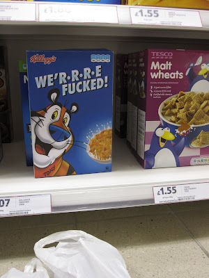
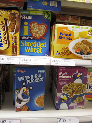 I think it pulls it off very well. Would be good to try and record peoples reactions but I simply don't have the time for stuff like that!
And here's Ed the friendly tiger, proud mascot.
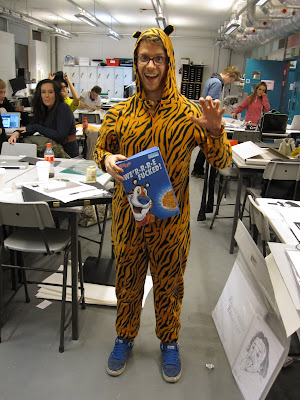

 I think it pulls it off very well. Would be good to try and record peoples reactions but I simply don't have the time for stuff like that!
And here's Ed the friendly tiger, proud mascot.

Printed Products / Cereal Box
And there we have it, the finished to scale box, there were a few hiccups. Firstly I totally forgot about the GDA facts and that I had shrunk them down by quite a bit so they were borderline illegible! Aswell as that when folded it did crack a bit, as you can in the photos on the edges. But apart from that i think its come out good, I've had a lot of good feedback from peers around the studio so that's a result right there.
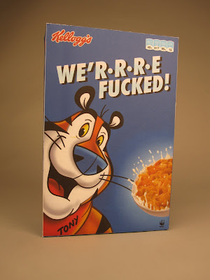
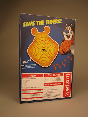


Cereal box


Cereal Box
So recreating the Frosties box, at first went horribly. for some reason I tried to make it in illustrator, which meant i couldnt import a decent image of tony or the box because I decreased the size of the image for Illustrator to let it open, so that was an issue. I tried to solve this by printing an image of tony from the box, trace him then scan him back in and live trace him as the live trace wasn't working at all with the transferred image. This went okay, giving me a basic image of tony but it wasn't as good as the original and this was evident.
It suddenly hit me, I needed to clearly do it in Photoshop, from there it was smooth sailing. Always learning the hard way. A short documentation of this proceeds...
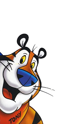
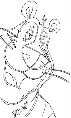
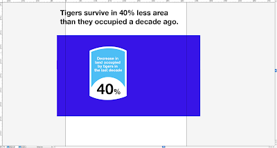
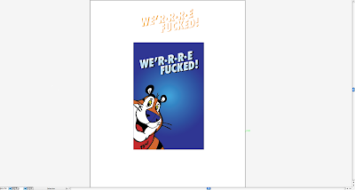
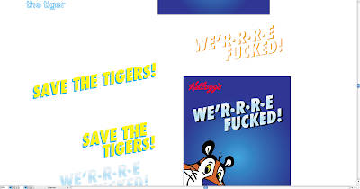
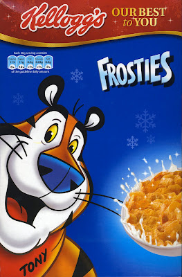
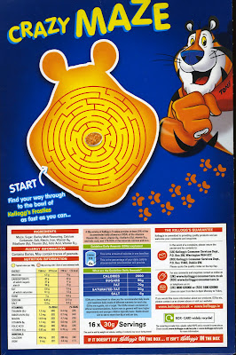
From scanning in the images and then taking them to Photoshop it went pretty smoothly, coming out with this...

I wanted the front to look just like a Frosties box, furthermore if someone was to walk past it at first glance it would seem normal but then that oh what? moment hits.
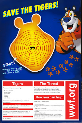
Then the information in place of GDA, and then using the back to get across the message where the ingredients and that would normally sit as well as still catering to kids with the cheeky puzzle of saving the tiger, pushing the message behind the box further.
 Time to take this to the net plan and print!
It suddenly hit me, I needed to clearly do it in Photoshop, from there it was smooth sailing. Always learning the hard way. A short documentation of this proceeds...


From scanning in the images and then taking them to Photoshop it went pretty smoothly, coming out with this...

I wanted the front to look just like a Frosties box, furthermore if someone was to walk past it at first glance it would seem normal but then that oh what? moment hits.
Then the information in place of GDA, and then using the back to get across the message where the ingredients and that would normally sit as well as still catering to kids with the cheeky puzzle of saving the tiger, pushing the message behind the box further.
 Time to take this to the net plan and print!
Cereal box
Extending this brief further, specifically the awareness campaign side of things.
Idea, create a Frosties esque cereal box, taking the design from the poster to this new format...


So combining the two of these to create a look-a-likey frosties box, using Tony the Tiger, but change all the details and info to the new slogan / info on how to save the tiger from extinction.
Idea, create a Frosties esque cereal box, taking the design from the poster to this new format...

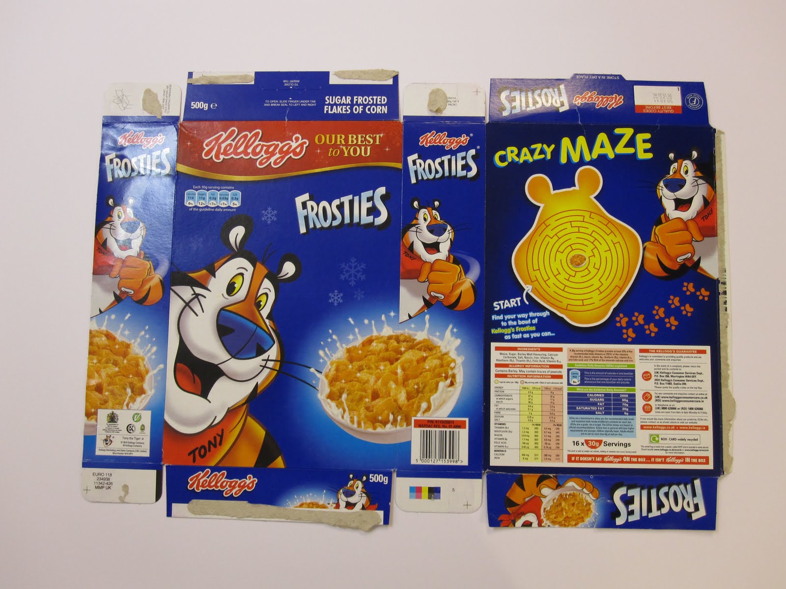
So combining the two of these to create a look-a-likey frosties box, using Tony the Tiger, but change all the details and info to the new slogan / info on how to save the tiger from extinction.
Tuesday, 7 December 2010
Quick Idea
 Idea for a poster / billboard. Lovely cute picture of some tigers, N'aawhhhhh!
Then Tony popping up, his cheery trusting self, with his new slogan. Would need a better quality image of Tony and also some basic info on the subject of tigers becoming extinct, etc. Potential?
How to Expand
I've been thinking of ways I can extend this brief. As it was just a live brief with the deliverables being just a poster, thats done, essentially. I reckon there's more potential in this, to extend it into a wider awareness campaign.
A few vague ideas I've had are:
. Playing with any famous tigers alongside Tony. Did my best to find and remember as many tigers as possible, so far my list is,
TONY THE TIGER
RAJAH - Aladdin
SHEERKHAN - Lion King
TIGGER
THUNDERCATS - TYGRA
TIGER WOODS -
CRINGER / BATTLE CAT (HeMan)
Other than that I am not aware of, but could create some form of a gang, Reservoir Dogs style thing. I think the only problem with doing something along these lines is if people would recognise all the different tigers.
. Having Tony as a kind of leader / teacher, informing everyone of how tigers are now 'Fucked' taking his new catchphrase to new places. Could be a billboard series, wildlife photography, with Tony just popping out of one corner, "Ther.r.r.e Fucked!" some info across it, similar to the poster!?
. Another idea is having a shock tactic to raise awareness, creating a frosties cereal box but change the name to, We'r.r.r.e Fucked!, then change all the dietary info to facts and stats of tigers, plus info on how to stop tigers from being extinct?
Could be interesting.
A few vague ideas I've had are:
. Playing with any famous tigers alongside Tony. Did my best to find and remember as many tigers as possible, so far my list is,
TONY THE TIGER
RAJAH - Aladdin
SHEERKHAN - Lion King
TIGGER
THUNDERCATS - TYGRA
TIGER WOODS -
CRINGER / BATTLE CAT (HeMan)
Other than that I am not aware of, but could create some form of a gang, Reservoir Dogs style thing. I think the only problem with doing something along these lines is if people would recognise all the different tigers.
. Having Tony as a kind of leader / teacher, informing everyone of how tigers are now 'Fucked' taking his new catchphrase to new places. Could be a billboard series, wildlife photography, with Tony just popping out of one corner, "Ther.r.r.e Fucked!" some info across it, similar to the poster!?
. Another idea is having a shock tactic to raise awareness, creating a frosties cereal box but change the name to, We'r.r.r.e Fucked!, then change all the dietary info to facts and stats of tigers, plus info on how to stop tigers from being extinct?
Could be interesting.
Poster Development

Grey version of the poster, any better? I think it gives it a bit more depth, solidity. Whether thats just because the white gets lost within my blog background, I'm not so sure. Does it need Tony in it?
Wednesday, 3 November 2010
Short Brief
Sat down the other day with my lunch and a host of various competition briefs, as I enjoyed a lovely Tune & salad baguette I went through and selected a few briefs that i found of interest.
One of them was from Good50x70.org . So for a couple of hours today I bashed out some ideas and came to some final design.
__________________________________
TIGeR exTIncTIon
Wwf
The year of the Tiger.
Background:
Tigers are one of the greatest icons of conservation and have been the focus for much of WWF’s work for over 40 years.
There is an urgent need for a renewed, focused, col- laborative effort to halt their decline and begin the pro- cess of restoring their numbers in the wild. 2010, the year of the Tiger in the Chinese lunar ca- lendar, is an unprecedented opportunity to bring tigers back from the brink.
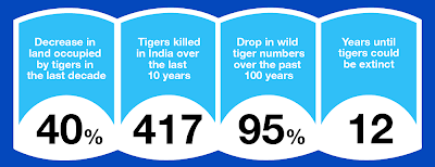
We have to act now or we risk facing the extinction of tigers in the wild by the next year of the Tiger in 2022. Wild tigers are an evocative icon of nature, a valuable and irreplaceable asset for people (employment, food sources, and cultural heritage) and a powerful guar- dian of nature, protecting tigers in the wild means pro- tecting some of the most spectacular places on Earth, including critically important forests and watersheds, and many other species.
A poaching epidemic is systematically emptying fo- rests of the last of the wild tigers. Concurrently, there is political will to re-think and re-boot tiger action – right now; the right people (Heads of State, the World Bank) in the right places (major meetings) are ready to make the right decision (Tiger Summit Declaration).
Message:
2010 is the year of the tiger in Chinese calendar, what better opportunity to raise attention to wild tiger po- pulations decline. Given the chance – enough space, prey and protection – tigers, one of the greatest icons of conservation, can recover.
Basically the brief is to raise awareness of the decline of wild tigers by creating a 50x70 poster.
From reading the brief I came up with some initial ideas, possible design styles etc and also looking into what had already entered and won. ( Unfortunately this competition brief's deadline was was back in April)

Out of my ideas one was calling to me over the rest, using bit of humour and possible shock tactics to grab the audience's attention I would use the most famous Tiger in this world, Tony.

 My idea was using the Frosties tag-line, They're Grrreat! and slightly changing it to show what a tiger might actually say upon learning of their chances to survive,
Doing my best to re-create the type used on the boxes without it looking too cheesy and childish, then changing the colour scheme to that of a tiger. More representative.


From here it was just a matter of adding some sort of copy to it, giving the quote from tony a context to sit within. I scanned through the brief again and decided to rephrase the following,
'We have to act now or we risk facing the extinction of tigers in the wild by the next year of the Tiger in 2022'
Then it was playing around with layout and composition making the design even and not to have the copy draw to much attention away from the 'we'rrre fucked'


Subscribe to:
Posts (Atom)