Tuesday, 25 May 2010

Digital Calendar Development


As in the printed version the calendar is bi-monthly, so before accessing the dates the audience will need to select a month, so i need to create a menu screen to appear when clicking on 'Dates'
...

Going through some experiments, trying out different compositions and all that, coming to my preferred design in the above. The two images showing the scroll down obviously.
Now to make it look bit more like a website page...


Adding images to represent external links, some being for the personalised pages of the signed artists on the actual website and others promoting a night on featuring one or more of the artists. Also here showing the highlighting of the selection. Furthermore, the scroll button enables the viewer to scroll down through the months, keeping the images / links in place.


Trying some white body text which when selected turns black, think i prefer this, sits more comfortably on the page and that, less loud and less is more. boom. But i think this part of the digital calendar is down. Moving on.


Monday, 24 May 2010

Digital Calendar Development


Cheeky play around with the two together, testing different shades and that, think maybe somewhere in the middle for the final one?


The problem of space has been solved. Basically the website starts with the top image on the home page, then clicking onto the Dates link the page then spreads out (above image) to reveal the online calendar.

Sunday, 23 May 2010

Wallpaper / Digital


After looking at some pretty websites and that I thought of making a kind of wallpaper for the main screen of the website to sit in front of! I remembered the site Size.co.uk used to have a similar thing on their old website. My plan is to make it quite a bit lighter as to not draw the eye away too much from the actual detail of the site.
This could also double up as a secondary digital product as a downloadable desktop background. cheers.

Online Calendar development


First move was to design some form of navigation bar for the site, this is something that would be the main body to the website, keeping Helvetica as everything so far uses it! When moving over a button or when clicking it it shall turn to the teal colour of the logo.


Playing around with the layout and size of the navi' bar, how it can fit within the screen space or control it. At the moment i think the one with the most potential is the style above, having the navi' bar dictate the width of the site. However this being said it does pose a problem with fitting the calendar on it, maintaining detail / info and that. Furthermore the outer part of it needs something more than just block colour.

Digital Calendar Development

With the print version of the calendar in the bag im now moving my attention onto the digital one. I haven't thoroughly thought it through until now, however i know that it will take the body of the labels website, www.mtarecords.co.uk which is under construction at this moment in time. Its important i feel to stress that Im not creating the whole website merely the parts which make the online calendar. Essentially i shall be proposing pages for the website under a design style that ideally would be taken throughout the whole website.
So cheeky brain storm, smash some ideas out, defining how it will work, whether its all on one page, style directions etc


The general style of it has already been determined by the designs of the logo & printed calendar so its just a matter of taking these to screens and seeing what works and that! So i shall go off and play around.

Calendar Final Product


Calendar Development

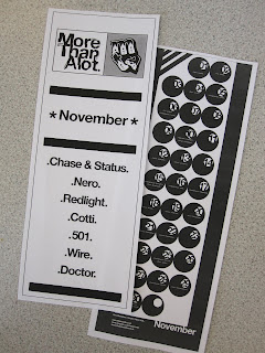
The beautiful calendar range! Minus the stock colour, but you get the jist...


For financial reasons i wont be printing all of the months to scale, I am going to select 4 different ones, one from each season. Doesn't really matter which ones though.