Looking back at this module I feel as though I have come a long way since last year, ending up with a body of work that I am proud to have done and happy with in terms of making a portfolio out of. Throughout OUGD301 I feel as though I have continuously learnt things the hard way, which although frustrating and aggravating means that I am still growing and getting better as a designer. Considering this I’ve come away feeling very positive as I believe I can improve in certain areas and aspects of design, which will only strengthen and help develop my skills set.
Although obvious and cliché I’ve learnt what is possible in terms of producing work in a short space of time, making the transition from second to third year quite well. Although stressful at times I feel I handled the work load well, organising and effectively managing my time in a manner that suited my style of work. Referring back to my statement of intent where I talked of working for briefs for two days at a time. This being a fairly successful process I followed and maintained throughout the module, and something that I feel really helped with getting all of my briefs up and running. Other than that my organisation and management mostly took the form of lists and A3 sized weekly planners, although a bit messy and causing a fair stack of off cut paper it really helped me to stay on top of each brief, allowing me to know at any given point where I was with each brief and what my next step was. Nevertheless saying this there is room for improvement on these skills, possibly making it a bit more formal, or having an icalendar aswell as these lists, this way I wont risk losing any important lists as the icalendar would act as a back up. As well as this I intend to use icalendar to help plan out the module in full, as for OUGD301 I was pretty much taking it week by week and at times day by day, although this didn’t create too many problems I feel things would have run a lot smoother if I had at least a loose monthly plan of action to stick to.
Something that I unfortunately learnt the hard way was how to work across different computers, organising files and keeping on top of all the work that was being produced at the same time. Essentially, don’t rely on pen-drives, I foolishly did and it did blow in my face a little, thankfully nothing huge or significant was lost, only a few hours of my day, but the little things all add up. So what I’ve taken from this is to always have hard copies of things, my intention is to make full use of my hard-drive, using that more often than just a couple of USB sticks.
Referring back to my module proposal and rationale, I feel as though I stayed true to what I proposed, that being I produced a body of type based work for subjects that I hold a strong interest in, designing across a range of formats and media and at times having fun doing so. I feel as though I could have exploited and maybe experimented a little more within certain briefs but as a whole I feel content with what I produced and proposed throughout all 6 projects. One thing I have noticed however that I intend to address next term is that I mostly designed for print throughout all the briefs, adding digital / for web designs as a small part of the range, I didn’t consciously avoid this as it is something I want to include within my work being that it is an area of design I hold an interest in. In regards to this I intend to try and split my later work down the middle having an even mix of digital and print, whether that means having projects that are purely one or the other or to produce both for a substantial large brief. A positive to take from this however is that from producing a body of mostly print based work my skills within that field have developed ten fold. In previous modules and briefs I have always been hesitant to print as I had little confidence within it and until now I didn’t have any print work I was fully happy with. Furthermore I now have a better understanding on stock choices, process of designing for print and the costs associated with it.
Overall Im very happy with the work I produced and more than satisfied with the effort I put in. Although it caused a fair amount of both stress and problems I now know what it takes to produce the kind of work I want and work I am proud to call my own. Furthermore I acknowledge that I am still learning and that there are some faults within my design process, which leads to me believing that I will only improve throughout the rest of my time here.
Wednesday, 15 December 2010
Tuesday, 14 December 2010
Project Managment
Here we have documentation of my project management. It essentially shows how I go about working and organising everything through a daily basis.
Mostly it consists of lists, things I need to do that day and as the module developed the more I was planning full weeks out, day by day setting certain amounts of work that I needed to get done. Although not a very formal way of working I feel it works well as it is planning and organising but is very easy to change and swap things around as problems / set backs were always popping up. What it did mean however, the amount of set backs I encountered that is, is that I did make a lot of plans and lists of 'to do's'.
Final Boards
Here we have the final board designs, ended up with three boards, one with the original poster and brief, then the extension of the brief went over two, one for product and design and the other for context, Tells all that needs to be said.
Context
Nipped into Tescos, planted the box and took a few snaps. Showing how it fits around other cereals and whether it looks genuine!
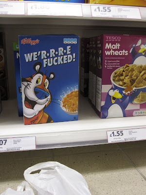
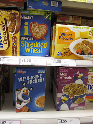 I think it pulls it off very well. Would be good to try and record peoples reactions but I simply don't have the time for stuff like that!
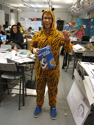
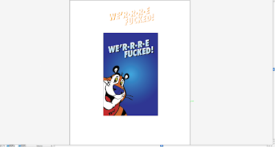
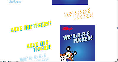
And here's Ed the friendly tiger, proud mascot.

 I think it pulls it off very well. Would be good to try and record peoples reactions but I simply don't have the time for stuff like that!
And here's Ed the friendly tiger, proud mascot.

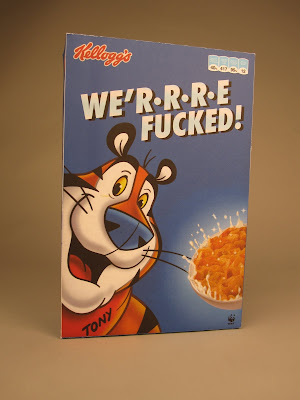
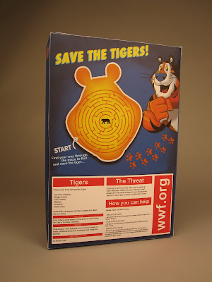
Printed Products / Cereal Box
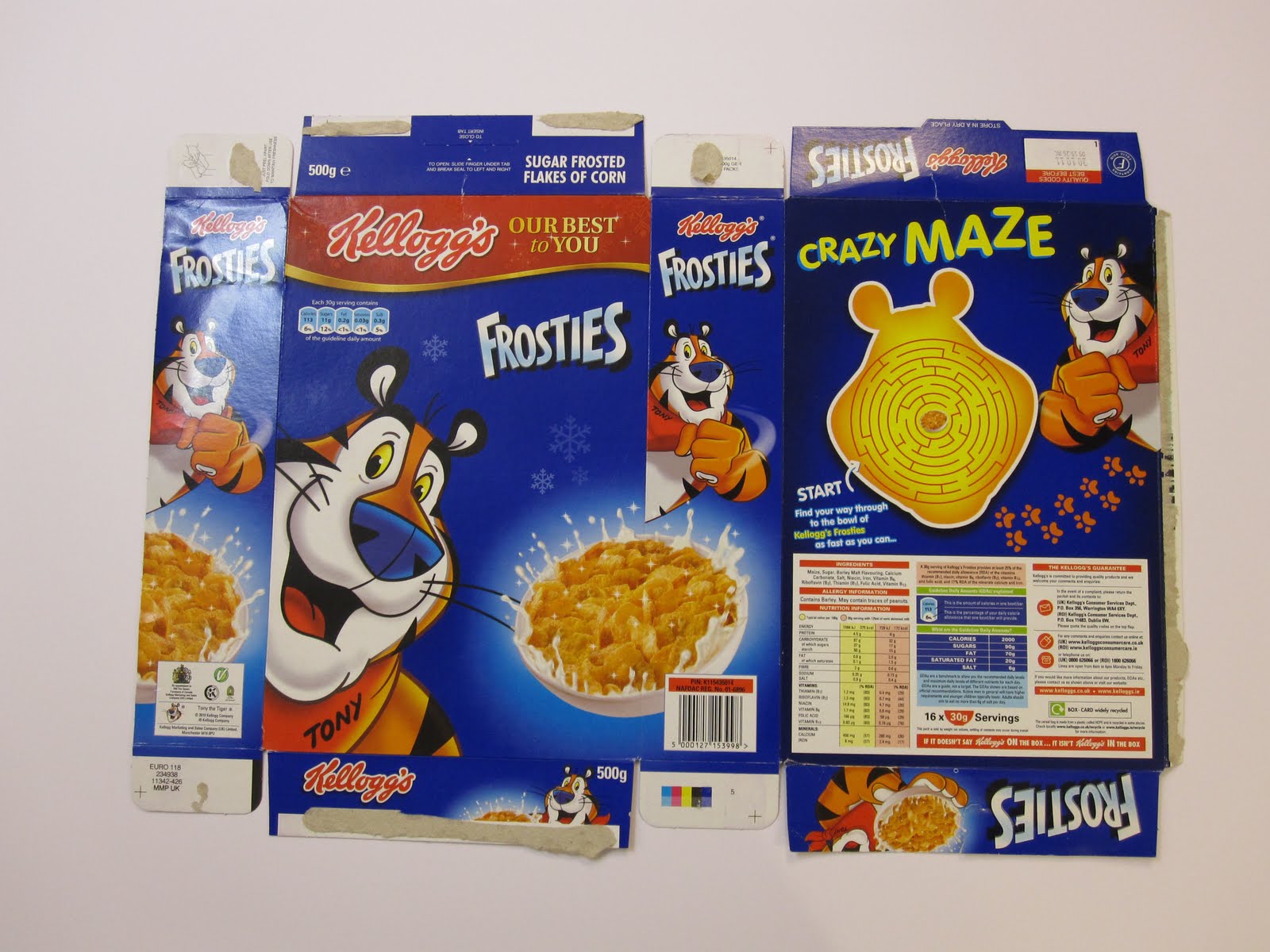
And there we have it, the finished to scale box, there were a few hiccups. Firstly I totally forgot about the GDA facts and that I had shrunk them down by quite a bit so they were borderline illegible! Aswell as that when folded it did crack a bit, as you can in the photos on the edges. But apart from that i think its come out good, I've had a lot of good feedback from peers around the studio so that's a result right there.


Cereal box


Cereal Box
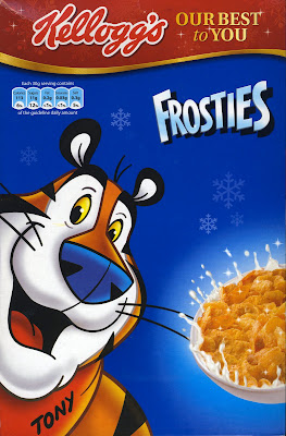
So recreating the Frosties box, at first went horribly. for some reason I tried to make it in illustrator, which meant i couldnt import a decent image of tony or the box because I decreased the size of the image for Illustrator to let it open, so that was an issue. I tried to solve this by printing an image of tony from the box, trace him then scan him back in and live trace him as the live trace wasn't working at all with the transferred image. This went okay, giving me a basic image of tony but it wasn't as good as the original and this was evident.
It suddenly hit me, I needed to clearly do it in Photoshop, from there it was smooth sailing. Always learning the hard way. A short documentation of this proceeds...
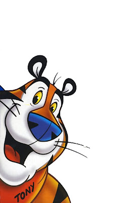
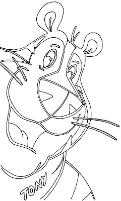
From scanning in the images and then taking them to Photoshop it went pretty smoothly, coming out with this...

I wanted the front to look just like a Frosties box, furthermore if someone was to walk past it at first glance it would seem normal but then that oh what? moment hits.
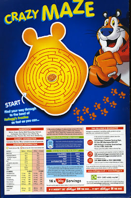
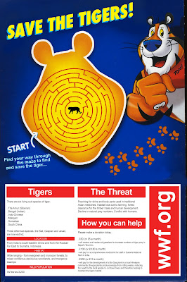
Then the information in place of GDA, and then using the back to get across the message where the ingredients and that would normally sit as well as still catering to kids with the cheeky puzzle of saving the tiger, pushing the message behind the box further.
 Time to take this to the net plan and print!
It suddenly hit me, I needed to clearly do it in Photoshop, from there it was smooth sailing. Always learning the hard way. A short documentation of this proceeds...


From scanning in the images and then taking them to Photoshop it went pretty smoothly, coming out with this...

I wanted the front to look just like a Frosties box, furthermore if someone was to walk past it at first glance it would seem normal but then that oh what? moment hits.
Then the information in place of GDA, and then using the back to get across the message where the ingredients and that would normally sit as well as still catering to kids with the cheeky puzzle of saving the tiger, pushing the message behind the box further.
 Time to take this to the net plan and print!
Cereal box
Extending this brief further, specifically the awareness campaign side of things.
Idea, create a Frosties esque cereal box, taking the design from the poster to this new format...


So combining the two of these to create a look-a-likey frosties box, using Tony the Tiger, but change all the details and info to the new slogan / info on how to save the tiger from extinction.
Idea, create a Frosties esque cereal box, taking the design from the poster to this new format...

So combining the two of these to create a look-a-likey frosties box, using Tony the Tiger, but change all the details and info to the new slogan / info on how to save the tiger from extinction.
Final Boards
As this was a very quick brief I've only had to use one board, simply stating the brief, showing the product and its context.
Context

Here showing what the logo / graphic would look like in the context of the Official Snowbombing facebook page.
Final Boards
Final boards for this brief. Four boards in total, as there was only really one product, one range and one context! Nice and simple brief.
Printed Products / Coverwrap
Printed coverwrap...


 Very happy with that, did have some concerns that the colour and reversed text would just bleed due to the newsprint being so thin, but it worked a treat.
here it is in context, as part of a Metro...


Unfortunately I didn't print any of the range as I couldn't afford it.


Range
The way I went about doing the design and how there shall be 5 releases (one a month) I made the decision to keep the front design the same throughout, only change the colour and obviously having the countdown change. So I bashed out a few colour ideas...


So I think instead Il just be using nice, bright'ish attracting colours.
Final choice
Made a decision on the countdown design. Keeping direct information at bay, keeping in sync with the general concept of the brief. Having it as a secret thing.
So the countdown here, showing days, hours and minutes, which represents the time till Snowbombing, Also having the search slogan from the front.
I wanted to keep the back quite bare, so to have the front being busy and n your face yet the back is a different kind of attracting, with only the one thing really there, draws people in a different way. If both sides were crazy busy I don't think it would be as effective as this.


New Updated Brief
Brief Title:
It’s like Ibizia in the snow
The Brief:
Design some form of a holiday brochure for next years Snowbombing festival. Of which will be a supplement inside the Metro newspaper.
Concept / Proposition:
Inform the audience & promote the festival so that not only will they know everything about Snowbombing but they feel they have to go.
Considerations:
What information is there to include? Are there details of more importance than others? If so hierarchy will become an issue you must address.
What can a holiday brochure be, what forms can it take? Think a little outside the box, afterall this is Snowbombing not a family holiday to cornwall.
Target Audience:
18-40 boarders, skiers, music enthusiasts, outgoing / sociable / exciting males & females.
Tone of Voice:
Mythical, Musical, Exciting
Background:
Snowbombing is a popular and ever-growing winter sport & music festival. It has been running since 2000 across a number of resorts, however from 2005 it has always been hosted by the Austrian resort of Mayrhofen.
The festival has seen many a great artists play, from Madness to FatBoy Slim, Grandmaster Flash to Dizzee rascal, plus pretty much all the big names within electronic and dance music.
Mandatory Requirements:
Holiday brochure for Snowbombing 2011
Deliverables:
An appropriate presentation of your designs.
Boards presenting your design process & development.
.Informational Brochure / Booklet
.Poster insert
Final Boards
Final boards for the project, ended up with 5 boards for this one. A good number I feel to fully show a brief.
Again another brief Im really happy with, something else that I am proud to have done and will be going in the ol' portfolio.
First editorial I've ever done an all.
BIG.
Photography for Boards
Here are a number of photos I took of the products, for documentation and also the boards. Getting a good mixture of close ups and full image, giving me a lot of options when coming to making the boards up.
The Booklet:
Booklet & Poster in context:
Context
Here showing the products in its context of being a supplement in the Metro, fits in beautifully.


Subscribe to:
Comments (Atom)