Saturday 12 December 2009

Silent Movies

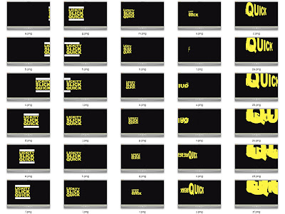
30 frame storyboards for my 4 final silent movies...


Friday 11 December 2009

Thursday 10 December 2009

Final video///TWO

For this video i plan to keep it very similar to the one below and only change a few things.
Firstly, i need to correct the video so you can see the all of the word 'quick' at the end, i also want to make the last bit of the animation become bigger and end with the work 'Quick' filling the majority of the screen. I am also tempted to try and fill the first screen frame with the phrase and try not leave any blank space, but this is not a definite yet.


Final video///ONE

Working from this video, for my first final video i want to make the movements smoother, and have more emphasis on the word 'quick'.
Firstly remove the pause from the pan across the screen to the 3D movement, then when the words come spiraling towards the video i plan to just have the quick come flying out as to bring full attention to that word, With this in mind i will need to play with the pace and direction of the movement as to be able to read it for the majority of the action.


Wednesday 9 December 2009

AfterEffects///FOUR

After looking at kinetic type videos i had a go at making my own again with the phrase, 'LICKITY-SLICK-QUICK'


I like the result, however i feel i can add more, possibly some 3d effects, maybe fill the entire screen with type, more movement to make it appear the frame is the thing moving and not the type itself.

AfterEffects///THREE

Right so with these couple of videos i played around with a 3D effect, i don't know if it is the correct way to create 3D, it kind of worked i guess! But i want to try and find out if i can make the words look actually 3D and not flat. 


Right well someones ruined my videos!  3D1 & 3D2 should not look like that! the actual words should be more centre, i don't know how this has happened, but i tell you what, im not best pleased! either way the general idea and movement is still apparent. 

AfterEffects///TWO

In these two videos i was looking at my designed phrase, 'LICKITY SLICK QUICK', playing with this phrase as a long line of words together, fairly simple, representing 'quick'...


The problems i found with this kind of animation was that if i went past a certain speed the text was totally undreadable, this causes problems as to keep it readable it cant go that quickly, and thats what i need to do, represent quick. 

Storyboard///Videos

Wanted to show the process of design i have gone through, from the storyboard workshops, then taking the ideas drawn and recreating them within After Effects.
These ideas are fairly simple, so are therefore something to progress from and to add too.


Monday 7 December 2009

Storyboard///

These are the first kind of storyboards i produced, looking at both words quick and boom. 


Wednesday 2 December 2009

AfterEffects///ONE

Had the first workshop on AfterEffects, first time on it and it was thoroughly enjoyable!

PONG!

This was my first attempt at making something, using transformations such as position and rotation and size.

Tuesday 1 December 2009

What is design for digital media///Silent Movie

Randomizer gave me the following...

QUICK

BOOM

LOST


For the silent movie brief i have decided to look at both BOOM, but more so QUICK. BOOM being my plan B effectively.

LICKITY-SLICK-QUICK.
-Inspired from the film, 8 Mile, during a rap battle B.Rabbit fights against a rapper name Lickity Spyt. It works to represent 'quick' as it says quick but furthermore the worlds together when said feel as though it should be said quite quickly as it rhymes and what not.
My plan is to use the phrase Lickity-slick-quick and play with the timing of how you speak it!

I timed myself saying it and it roughly takes just over a second to say it all, so i think i may have to repeat the phrase unless i try and carry on the rhyme. We shall see.

Monday 2 November 2009

What is good? Part///TWO/Net Plans

These are the net plans for the existing packaging which i shall be following and re-designing!


(Net Plan Research coming soon...)

What is good? Part///TWO/image researchTWO

Music Influenced Imagery///


This is fitting imagery and one kind of style of imagery and layout i could choose to use for designing my package with! This being relevant to the sound system and music, This music being suited to the system due to its bass sound abilities, and the product will be most likely be bought by people who listen to the following genre of music, as i am and did buy the product!

what is good? Part///TWO/image research

Apple Packaging Range///


As i said earlier i admire apple as a company who really package their products well and successfully! The style tending to be a simple design, showing the product cleanly on a white or black background, the box sometimes acting as the shape so each side shows that side of the product!


Edited Photos///


Images possibly to be used as the imagery on the packaging, cut off/sharp angled photos!


Cardboard packaging///


I did a collection of all the non-broken or ripped boxes around my house and photographed them! 
Doing this shows the variety of cardboard packaging out there, firstly there are the purely functional boxes which are only printed with black ink, for simple instructions/warnings or like the amazon box, advertising the brand/company.
Then on the other hand you have your more designed boxes which help to sell and promote the product! Take the 'The Beatles, Rockband' box for example, this is a big part of the attraction to the product itself, it is its own advertisement, the better looking it is the more effective/more sales it will get. Aesthetically pleasing. 
This being what i am planning to do!  

What is good? Part///TWO/Feedback

What i got from the first feedback session with Justin,  was basically what actions i need to take from here!

. Firstly simplify the message of what makes the product that good!
. Describe and promote the actual sound quality!
. Image production, before i can start with any real designs i need to look at existing imagery and designs, get a feel of what i will design, what look il be going for! 
.  Start designing the sides of the boxes leading to design development. 


What does make the product as good as i think it is!?
=Well the product is that good, as for a non-professional product it is such a loud system, yet the quality of the sound is very high even at peak volume the quality is superb!
no distortion!
Simplifying this down,
the sound is very clear and distinct! and it is as loud as hell! how can i get this across to the customer!?
Using the tech jarg does the job but a lot of people may not understand why it makes it so good, or why the stats are good. So il have to design something to make it easier to understand, my thoughts to answer this atm is to produce a small flyer stating things like as powerful(wattage wise) as something else, pref obscure, make it a bit humerous, light hearted not deadly serious as after all this product is all about pleasure!

Describe and promote the sound quality?
Thesaurus time, using the words, Loud and Clear.
-blaring, booming, deafening, roaring, thunderous, thundering, ear-splitting, ear-piercing, powerful, forceful! 
-Clear, crystal clear, Translucent, Distinct, distinctly clear, beautifully etc!

Image production please,


What is good? Part///TWO/Package

The original packaging for the product,


Now this box, this design is not really that good! i dont think!
It comes across as a bit too cheesy for what is a top quality and fairly expensive product! (RRP£349) 
Its all fairly 'flashy' the colour scheme runs throughout the Logitech product packaging and i dont think it looks that good! It's very busy over the package as the designers have tried to cover all the box, this is the wrong angle to go down i feel. For a high end product in its field which it is, what i feel would be more appropriate is something more in the style of Apple packaging, simple, minimal, elegant, stylish! 

What is good? Part///TWO/Product

Photographs of the Logitech Z5500,


What is good? Part///TWO/

PACKAGES & INFORMS


BOOM. 

the reasons for this choice, well i didnt want to make a form of intructions, overall the potential seemed better within packages and informs. More importantly informs allows me to really relate back to the argument in the first part of the brief, this being what is needed for the requirements of this project. 

THE PLAN:

to inform why the loigitech z5500 is good, referring to me pre-existing argument! 

Form of delivery
im gonna go with designing the packaging for the product itself, the reasons being the pre existing package is rather 'orrible! And furthermore im quite excited about designing something like this at this scale! 
Now do i put the information on or in the package? 
I think i will put information onto the packaging, however it may be minimal and will more than likely stick to the tech jargon. So i intend to produce a seperate product explaining the tech jargon or general more detail of the info! 


What is good? Part///TWO/Choice and initial ideas

So to choose what to do?

Brainstorm each idea briefly,

. Packages&Promotes

what to package- the sound system (Product) 
what to advertise- a general advertisement for it .tv/poster/newspaper advertisement/ internet page
. An argos page- advertisment like style
. an advert on he box itself, (the box sells itself?) 
Packaging for something else advertising the product!
- a coupon/voucher?


. Packages&Informs

packing for the sound system itself
- Techinical information on box, simplified? tech jargon etc
-informing of my argument for why the product is good?
logitech as a company?
Giving obscure info on the product like its as loud as two lions? 
Informing on how to use/what to listen to, certain genres etc


. Packages&Persuades

Persuading to buy?
a form of advert, campaign, in a political sense, persuading people to buy by telling all of its good points-basing on my previous found argument for the product. 
-Persuading you to think its very good! or that you need it in your life! 


. Packages&Instructs  

Instructs to do what? 
- How to assemble, re-design pre-exisiting 
-how not to blow up, humourous angle
- how to set up for different situations/people
.dj's
. for gamers
. for surround sound/home cinema
. computer system etc.
DOES THIS GO ON THE INSIDE OF THE PACKAGE? ON THE PACKAGE? OR OUTSIDE THE PACKAGE? A SEPERATE PIECE ASWELL AS THE PACKAGING?

So to choose from these, what has the most potential, what am i feeling? 


...


I'm torn between two, 
. Packaging&Informs
. Packaging&Instructs


What is good? Part///TWO/Packaging

Some of my favourite examples of contemporary package design; 


. Nike shoe-box,


Here are two styles from nike for the same thing, One being a vibrant, POW! in your face, possible spot colour design, deffo my bag baby! its simple and effective, logo, brand name, colour!
The other is much more subtle, with nearly all of nike's sub-logos printed in a high opaque setting colour similar to the cardboard itself!

. Johnny Cupcakes t shirt packaging,

After having the lecture from Johnny last year i got to see his products and packaging etc, needless to say, im now a fan, the packaging is personal and just that little bit more special!


. Heineken Case,

It's Heineken, end of.

. Macbook packaging,


Apple is just wonderful, its packaging is no none-sense, bright white and clear. Clever and effective packaging all round. I reckon its gotta be like made in sweat shops or something, its gotta have a negative impact in someway!